- Advent of Gutenberg 1 – Introduction
- Advent of Gutenberg 2 – Text
- Advent of Gutenberg 3 – Media
- Advent of Gutenberg 4 – Block fiesta
- Advent of Gutenberg 5 – UI Overview
- Advent of Gutenberg 6 – Block Sharing
- Advent of Gutenberg 7 – Keyboard Efficiency

One of the core parts of WordPress, ever since I have used it, has been the rich text editing experience. That experience is powered primarily by TinyMCE. TinyMCE helps manage some of the oddities of HTML’s contenteditable interface. The new Gutenberg editor, by default, also uses TinyMCE in a more stripped down form. You can access the classic editor experience from within Gutenberg, by using the classic block. To add in a classic block, we need to open up the block inserter, and search for Classic. Once we find it we can just click to insert it into our content.
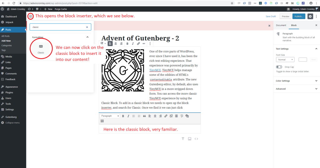
I am now typing in the classic block. It won’t be distinguishable when you are reading this post, but it is nonetheless a classic block. We can do most of the things we are accustomed to in WordPress’s content area.
- Here is a bulleted list
- With items
- Sub items!
- Woo!
- An ordered list.
- Very similar experience to content editing.
Strikethrough text
Different color text.
Insert media.
It is the same classic editing experience of WordPress embedded within the new content editor. If Gutenberg is really not jiving with you, I would encourage you to at least work with the classic block, and then start exploring new blocks. This might serve as a smoother transition.
We are now exiting the classic experience. The downside of the classic experience is that we do not have blocks. It is just one big block of rich text. We lose control over the individual units. Remember, it’s all about the blocks. If I want to move anything, I have to use cut and paste. In Gutenberg we have controls to easily move blocks up and down.
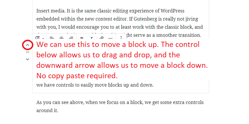
As you can see above, when we focus on a block, we get some extra controls around it. Cut and paste in particular, has been something that I see people struggle with. It is definitely a wide spread convention that any computer user is familiar with, but in my town, maybe shocking to some, computer usage is probably not something that everyone is totally familiar with. Copy and paste are an assumption we rely upon. I have seen people delete entire paragraphs to re order their content. Mastering copy paste can be much trickier than simply using the up and down buttons to shift around content; a small win.
When we are working with blocks, we get many additional controls. Let’s look at some of the new and familiar aspects of text in Gutenberg.
Managing text
As we type, the block controls fade into the background, allowing us to fully focus on our words. When we select a block, we see the block toolbar popup, let’s break that down a bit.
Block toolbar

Above, we see the block toolbar hovering on top of the text. The first control is the block type switcher, allowing us to convert the block to another type. We aren’t going to worry about that right now. Next to the switcher we see the text alignment controls. We can left align, center, and right align our text on a paragraph by paragraph basis very easily.
Right aligned.
Center aligned
Left aligned.
Next up after that are our classic text formatters. We have bold, italic, link and strikethrough. Very neat, and readily available to use, as they appear right above the block we are working on. After the formatters is the more options control, represented by three vertical dots.
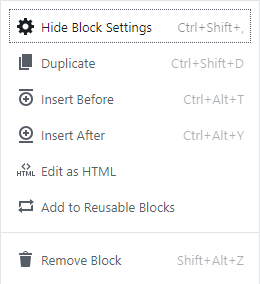
More options will feature generic options for the block, like duplicating, deleting etc. It will also show the quick keys for any actions that have a quick key. Each block toolbar as a whole, will have its own unique controls that are specific to it.
Each toolbar is also very customizable from a developer perspective; allowing new controls, or user specific controls to be added and removed. The block controls don’t stop there either. We also get another area of the editor that allows us to interact with blocks, the sidebar.
Sidebar controls
With the paragraph block, by default we have some cool sidebar controls. This paragraph is using the drop cap style. Which, looks really neat and adds a nice stylistic touch, all we have to do is toggle on the drop cap for a paragraph in the sidebar and we are good to go. We can also adjust the font size. In general it is probably not best to mess with the font sizes too much, but it is there if you really need it. Pretty neat.
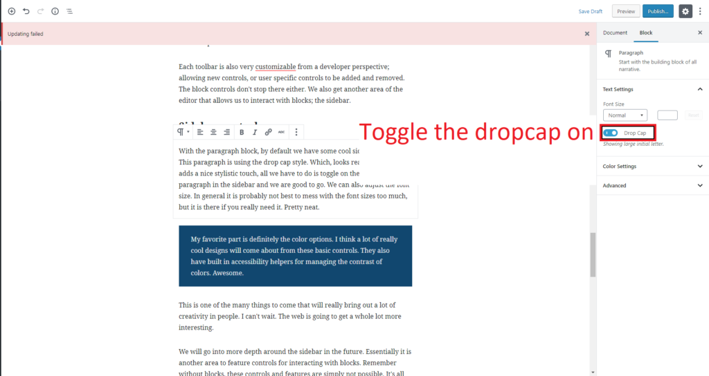
The sidebar controls are really going to be an amazing area to explore what can be done with content. This is an area where plugins can really do a lot of incredible things. I can also see some plugins going completely overboard and ruining the experience. Let’s try to not go overboard.
My favorite part is definitely the color options. I think a lot of really cool designs will come about from these basic controls. They also have built in accessibility helpers for managing the contrast of colors. Awesome.
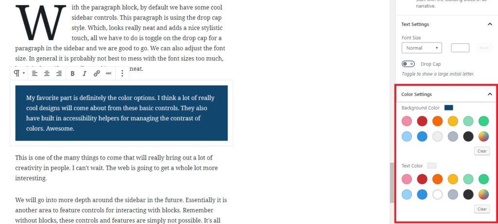
This is one of the many things to come that will really bring out a lot of creativity in people. I can’t wait. The web is going to get a whole lot more interesting.
We will go into more depth around the sidebar in the future. Essentially it is another area to feature controls for interacting with blocks. Remember without blocks, these controls and features are simply not possible. It’s all about the blocks.
Managing headings
Another great aspect of the block concept is that we can very easily add in features like anchor text. Here is a link to the managing headings area. All I had to do was add anchor text to the “Managing headings” block, and then create a link with the URL matching that text, #managing-headings. You can set the anchor text to whatever you want, just make sure it matches up with the links you want to use. Before, without the block model, this would require manual editing of HTML, which you can still do, but in my opinion it is much easier to use the new interface. What if you don’t know HTML, or care to know? Well now you don’t have to.
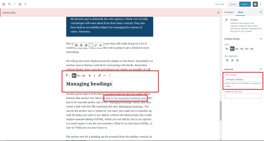
The anchor text for a heading can be accessed from the sidebar controls, in the advanced tab.
Headings serve as a way to structure our documents, in a semantic manner. Now that Gutenberg brings the block model to us, it is relatively simple to add a table of contents to our posts now, organized by heading structure. This could be done as a block, which we will see in the future.
Heading block toolbar
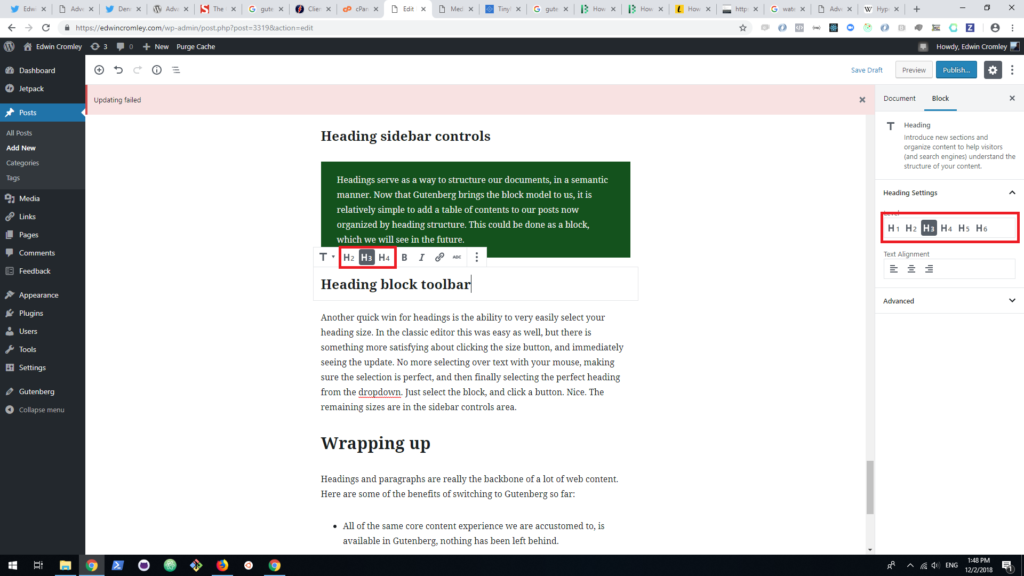
Another quick win for headings is the ability to easily select your heading size. In the classic editor this was more in line with Microsoft Word. There is something more satisfying about clicking the size button, and immediately seeing the update. No more selecting over text with your mouse, making sure the selection is perfect, and then finally selecting the perfect heading from the dropdown. Just select the block, and click a button. Nice. Additional sizes are in the sidebar controls area.
Wrapping up
Headings and paragraphs are really the backbone of a lot of web content. Here are some of the benefits of switching to Gutenberg so far:
- All of the same core content experience we are accustomed to, is available in Gutenberg, nothing has been left behind.
- By having blocks, we now have more fine grained control over the structure of a document.
- Text color, and background color.
- Drop caps.
- Font size.
- We can do important tasks more easily that used to be a pain.
- Heading anchor text.
It’s not as though these tasks were impossible in the classic editor, it is that they were not as at hand, ready for us to grab and use. I feel so much more creative when writing in the Gutenberg editor. It’s just fun.
Text is only one part of content experience. Next we will be looking at how Gutenberg handles media elements. I hope you are enjoying the series so far, and comeback tomorrow for the next post!
