- Advent of Gutenberg 1 – Introduction
- Advent of Gutenberg 2 – Text
- Advent of Gutenberg 3 – Media
- Advent of Gutenberg 4 – Block fiesta
- Advent of Gutenberg 5 – UI Overview
- Advent of Gutenberg 6 – Block Sharing
- Advent of Gutenberg 7 – Keyboard Efficiency

Text is a primary content type, but more and more the interactions taking place are going beyond text. Images, audio, video, and visualizations are all becoming more prevalent. Text is a great medium. In most cases, it is more accessible, and easy to produce. Text does have some barriers, like video, you have to actively engage it by observing it, where audio allows you to passively consume the content, while working on something else. Video in some ways can also be a much quicker way of learning how to do something and is a great instructional medium, as it combines both the audio and visual aspects together. WordPress already has great support for different web media types, and Gutenberg will help make these easier to access and interact with.
Media in WordPress
WordPress in its current form has a media library allowing you to manage the media on your site. We’ll come back to this. One of the best parts of WordPress is that it plays nice with other content platforms, allowing us to share information more easily.
Embedding content
The current editor also allows for embedding content from other sites. For example you might add a video to your page by pasting a YouTube link into your content, and clicking enter. This process is one step easier in Gutenberg as you just paste the link, and the editor understands you are trying to embed a video, and creates a new block for you.
WordPress was ahead of the game as far as embedding other content, but now it is even further ahead. It is just so easy to add embeds. You can also add embed blocks. They look something like this:
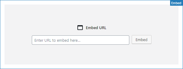
We simply just enter the link, and if the link is embeddable, we magically get our embedded content. Super cool. So far in this series I have been embedding twitter links. Twitter can be crazy, but there is a lot of great stuff on it. Instead of expanding on tweets in the limited character set, where lots of bickering can happen, we can add commentary via a more thorough blog post. This was possible before in the classic editor, but something about this process is just so nice in Gutenberg.
Try out adding a tweet to one of your posts:
- Go to twitter
- Find the tweet you want to embed.
- In the top right you will see a downward arrow. Click there to expand the menu and “Copy link to Tweet”.
- In the editor on a new block line, paste the link. It will automatically start embedding the tweet. You can get to a new block line by hitting Enter, or the down arrow at the end of the current block you are typing in. ( More on this in the future. )
- See the tweet immediately appear in a stylish format.
Not much of a difference between the classic editor, but it is still a great experience. So far we have looked at embedding media and content from outside sources. Let’s look at a staple in WordPress; images.
Image handling in Gutenberg
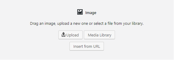
The above shows the default view of an image block, before we have selected an image. This view is known as a placeholder. Placeholders are great for a number of reasons. One of the most important is content layout. If we wanted to layout our content ahead of time, we could set a bunch of image blocks in various places, with the placeholders ready to go. We could then hand that off to our coworker in charge of selecting what media gets used. This is typically done in the current editor by using placeholder images, but with blocks, it will become more straightforward. It’s all about the blocks.
We have three options for adding an image: upload, media library, and “insert from URL”. Upload allows us to directly upload an image. I personally have had mixed results with this, and do not use it ever. Media Library will open up our media library and let us select the image to use.
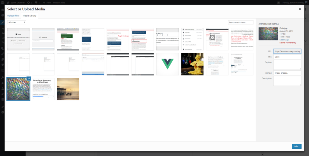
I have basically opened two tabs, one with my editor open, and one with the media library open. I simply just upload new images to the library, then switch to Gutenberg and pull in the new image. It’s all JavaScript powered, so no page refresh is necessary. It is actually a very quick workflow. Insert from URL seems to work well too, enjoy wapuu:

You can also drag and drop images into the editor. Currently, like the upload, my own experience has not been the best. Images start to upload but fail. The functionality has been tested rigorously, but for whatever reason my setup makes that extra hard. Don’t let little things like this take away from the Gutenberg experience. This is just the beginning. WordPress has a track record of fixing and accommodating all sorts of issues. WordPress has a strong people-centric focus.
All of the above is currently available in the classic editor. Gutenberg adds some new cool image features.
What’s new about images?
The cover image block!
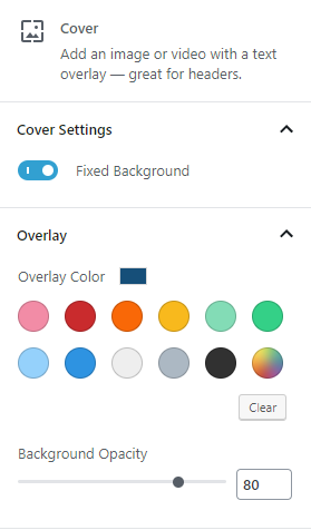
One of the coolest blocks is the cover image block, shown above. We get some text over a full cover image background. We can even set a fixed background effect for a nice visual touch. Like any block a lot of the extra options are found in the sidebar, when that block is selected. Always check out the sidebar to see what is available!
Right off the bat we see the fixed background control set to on. We also see the overlay controls. In the post we see a nice dark blue overlay, by default it is a black overlay. You can also just set the opacity to 100%, and get a full screen background with text.
Remember that each of these sidebar areas are available for developers to extend the functionality of each block type. Who knows what people will come up with.
Working with images in the new editor.
Let’s look a bit more in depth at what options there are to work with in Gutenberg. We will start with the block toolbar.
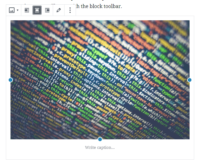
Here you can see an image block selected with the toolbar above it. We currently have the center alignment set. You can left or right align an image which will float the content to the left or right, allowing the text to wrap around the image. The left and right alignment experience could use some tweaking, but it does work. We can quickly also change the image by accessing the Edit button, represented by a pencil. We also get sidebar controls.
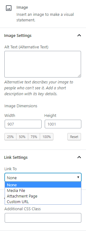
We can edit the alt text, image dimensions, link setting, and additional CSS class from the sidebar by default. If you can imagine a setting that is missing from this menu, plugins will become available to fill these gaps, or you can make your own!
Remember this is the foundation. Unlike the classic editor, room for extending the functionality is possible, and available.
With the new block model, galleries become much more engaging. We will look at galleries more in the future.
What lies ahead for images?
There is a lot of future room for improvement around images. With the block concept available to us, we will potentially be able to make different crops for different screen sizes or have an image set that serves a different image to different audience segments. This area is a big struggle for web content in general, and I feel that Gutenberg puts WordPress in a unique position to solve this problem.
Responsive images will become easier to manage, currently it is very challenging. This will greatly improve the mobile experience, a major win for the web.
I can also see new image editing tools being built into WordPress. You could upload a raw image, do a custom crop, maybe apply some filters, do some various light editing. The possibilities are very open, and I think we will see a lot of these new experiences being provided via plugins. Maybe the best will get rolled into core itself. Google docs has great image editing tools for this purpose. With the foundation presented by Gutenberg, this might allow WordPress to even surpass that experience.
Wrapping up
The media library plays a critical role in the new editing experience, allowing us to quickly add in content. Below we see a list of some of the common media blocks available:
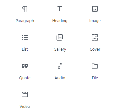
Image, galleries, cover image, audio, file, and video are all media blocks ready to go out of the box. These were all possible previously in the classic editor, but now everything is a bit more discoverable. In the past I might have to go to an external source and read about WordPress to understand how to use it. This problem is not fully solved, or ever will be, but the new editor interface is more inviting to explore, and you can figure things quickly by just poking around.
Leave any comments or feedback on what you would like to hear about next in the series!