Advent of Gutenberg – 7

For me personally, one of the main improvements in Gutenberg, compared to the classic WordPress editor, is the speed at which you can create content. A lot of this is due to the keyboard efficiency. There are a lot of hidden keyboard tools that we will look at, and some tips on how to quickly get content going in Gutenberg. I am on a Windows PC, so the quick keys mentioned will be different for MacOSX users. My daughter tried out the mobile experience as well for her website and thought it was relatively easy to use as well. I am very excited about getting more youth involved in using WordPress, which will be covered in future posts.

Back to the topic at hand.

Keyboard efficiency

Microsoft Word was in many ways the killer app of early PC days. It was most likely the culprit leading to the end of the typewriter. The typewriter in many ways has never died, as many are still stuck using the QWERTY keyboard layout, designed around the mechanical functionality of the typewriter, not the ease of human typing. Alternatives of keyboard layout have received minimal adoption. The speed at which we type can have a great impact. Time is the most valuable resource. Although most of us may be tied to a slower keyboard layout, we are definitely tied to a slower method of expressing thought. Gutenberg is a step in the right direction towards a more responsive interface for quickly getting our thoughts onto a canvas.

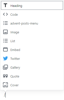
When I first started using Gutenberg I used all of the visual graphical elements to insert content. Now I have dug a bit deeper into the keyboard shortcuts, and do almost all of my posts entirely via the keyboard. It is an incredibly fluid experience, that will only improve from here. One of the biggest speed increases is using the slash commands (/). When a new block line is inserted you can access a list of blocks to insert by pressing /, similar to Slack.

Typing in forward slash on a new line opens the slash command palette.
Type slash on a new block line to open the command palette.

Once you type in the slash you will see a list of the most recently used blocks tailored to your needs. The pop up window will not be a complete list of every command available, and you will need to find those out for yourself, generally the name of a block is also the name of a command to insert a block. As you type after the slash command you will get an autocomplete functionality of the potential block command you are trying to do. So typing /media will bring me to creating the media and text below.

Typing after the slash command drives an autocomplete functionality.

Typing a command will start to trigger an autocomplete. Very nifty.

When dealing with images and other layout elements I noticed it was sometimes tricky to create a new block, and relying on hitting the “Enter”/”Return” key was not always feasible. Luckily there is a keyboard shortcut to add a block either above or below the currently focused block. I typically add one after by using “Ctrl + Alt + Y”. To add a block before you can do “Ctrl + Alt + T”. Knowing these two commands coupled with the slash command has greatly increased the speed at which I can get my thoughts out. No more, cut/copy paste. Very fluid.

Another cool thing is duplication, by using “Ctrl + Shift + D”.

Another cool thing is duplication, by using “Ctrl + Shift + D”.

Keyboard shortcuts

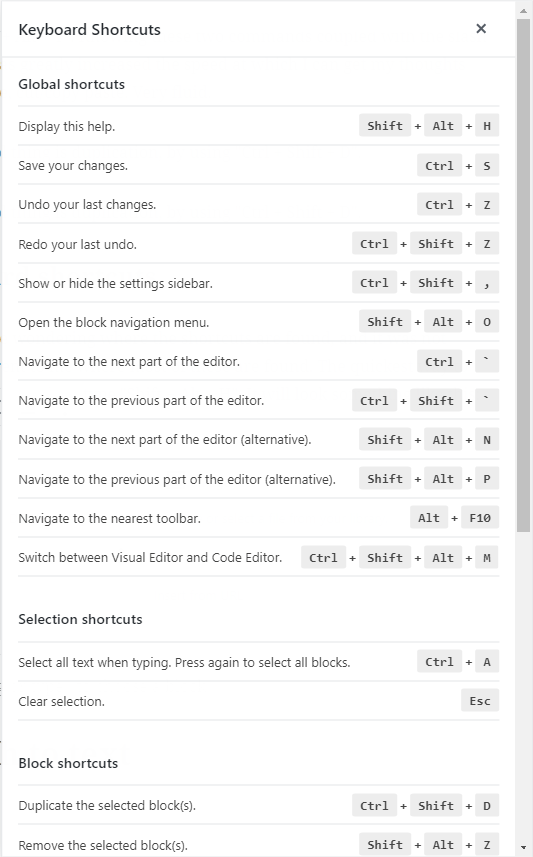
You might be wondering where the shortcuts are found, and it was not super apparent to me where most of these are found. The quickest way to view all shortcuts is to type “Shift + Alt + H”. It will look something like this:

Keyboard shortcuts menu accessible via Shift + Alt + H

How did we get here in the first place though? In the top toolbar there is a “Show more tools & options” menu, represented by three dots. Under the Tools section there is the Keyboard Shortcuts menu, with the keyboard shortcut displayed next to it.

From here we get an extensive overview of the keyboard shortcuts for the editor. These really open up a lot of keyboard efficiency, and will greatly reduce the amount of time we spend creating content. I am not aware if there was anything similar in the classic WordPress editor experience.

Speech to text

I can also see some cool improvements in the future surrounding a speech to text interface for Gutenberg. It would be cool to be able to say a command like, “Gutenberg, insert an image block”, which would trigger an image block to be inserted below the current block selection. Due to our new access to the underlying data model of content, new interfaces for creating content beyond keyboard and mouse will become more feasible. It’s all about the blocks.

Wrapping Up

One of the many gifts that Gutenberg is bring to the web is a new more efficient medium of representing our thoughts and ideas. I think the level of creativity we are going to see over the next years will profoundly shape the future of the web. As always stay tuned for the rest of the series and drop some comments for ideas of your own.

Advent of Gutenberg – 6

With the block concept coming into WordPress, we will see new opportunities to share content. Services like Gutenberg Cloud will most likely pop up, and of course the WordPress.org plugin repository will also be available. One thing about something like Gutenberg Cloud is that you could potentially just grab blocks directly from within the editor. Pretty neat.

Due to Drupal also adopting the Gutenberg editor, any CMS that implements blocks the WordPress way, will be able to leverage the content from both ecosystems. This is very exciting and interesting.

Block sharing

For the most part, I am excited about this new idea. Unfortunately, there are people with malicious intention, and I definitely fear that with an explosion of small reusable pieces, we will see an increase of security vulnerabilities around the sharing of blocks. More on that later.

The positives are very exciting. There is the potential to limit how frequently you will go to the plugins tab. It’s definitely also possible that themes themselves will go away as well. I think a lot of this will be due to block sharing. Let’s say I build a block that allows you to apply a snapchatesque filter to your images. Since this would most likely be implemented in JavaScript (not necessarily the filter itself), it will be easy to share to all of the different platforms that support the block model present in Gutenberg. That would be a specific block and if you wanted to build a lot of weird goofy dog face pictures on your site, it would be perfect.

There will be many niche blocks, but there will also be general purpose blocks. Much like the internal parts of WordPress itself, the nav menus, widgets, shortcodes, etc. are all reasons why we use WordPress. They allow us to create content quickly and with relatively minimal headache. Blocks will supplant the need for a lot of these core APIs. There has been worry over the reduced role of meta boxes, but most likely it will all succumb to a block based implementation, which will probably be better anyways.

Currently, which we haven’t touched on too much in Gutenberg is the concept of reusable blocks. This is where I am the most excited about block sharing.

Reusable blocks

Right below is the first reusable block I am using on my site.

There is a weird bug, currently where I get an extra list item. Oh well not too big of a deal. The main exciting part is that I can use this across all of my posts now. Click on any of the links to see the same list being used across all. We get to share content within our own WordPress install. Pretty cool. But with things like the REST API available, we can potentially even provide content that can be widely distributed as a “reusable block”. I think there is a lot of room for innovation around this. Essentially since the reusable block is also essentially just a custom post type.

Although there is a lot of potential for creativity and sharing, I am somewhat concerned about the potential negatives.

The downsides

There are a two main downsides that are apparent to me: security, and code sprawl.

Security

As mentioned above, security, and education around security is going to be critical. If we make it too easy to grab whatever block from wherever, we are most likely in big trouble. This isn’t necessarily anything new, as you could make the argument that the WordPress.org plugin repository can be a major attack vector as well. This is definitely a reasonably fair assessment. The only difference with blocks, is that they will most likely be more prolific than plugins.

Blocks in their nature are most likely going to be smaller than an entire plugin. Purely due to the reduced amount of code needing to be written for a block, I can see a lot more blocks being created. Blocks are also mainly written in JavaScript, which we have established as the most widely used language. A lot of people are going to be creating a lot of block. In this massive mess of blocks, it will definitely be easy for bad actors to sneak in. If it becomes very easy to just grab a block from some platform, how will users be alerted around the potential dangers ahead? We need to start coming up with good solutions now.

Code Sprawl

We are probably in an era of immense code sprawl already. It might get worse. We will most likely see a lot of blocks that are pretty much the same block. Does this benefit the users? Will we be able to encourage new coders if there are clear winners already established for certain blocks? I think the ability to share blocks will potentially cut down on the creation of the same blocks, but I can definitely see the flip side where it increases. Maybe this isn’t a bad thing at all either. I tend to think that it is, but maybe it really does not matter all that much.

With the rise of distributed computing platforms, I think it will matter, as we will want a way to condense the amount of information we are sharing amongst each other to only what is necessary. The efficiency gains in distributed computing won’t mean very much if everyone has a slightly different file that does 99.9% the same thing. We will need some sort of block unifier, that can take the contributions of many and turn it into one singular block.

Wrapping Up

Gutenberg really opens up a lot of unique opportunities that were not previously possible. I am excited for the future and to see what comes. We will definitely need to be aware of the potential pitfalls ahead and start implementing some safeguards or strategies against them.

Advent of Gutenberg – 5

We are going to look at the editor UI in greater detail now. From a technical perspective the user interface is written in JavaScript leveraging the React library. There has been great effort to make the editor experience extensible like the rest of WordPress, which we will look at more in the future. The tech choices for Gutenberg are also almost as important as the project itself.

Significance of JavaScript

JavaScript is the leading client side language of the web. JavaScript is also most likely the most widely used language as well. Popularity doesn’t necessarily have a positive connotation, but it does mean that there is a wide group of people fluent in JavaScript.

This familiarity enables a lot of things. It enables new developers to more easily and quickly get involved with WordPress, as the client side shifts more and more to JavaScript functionality. In the goal of democratizing publishing, it might make sense to make one of the widely used programming languages a flagship aspect of the platform. JavaScript usage is not anything new to WordPress, but Gutenberg definitely takes it to a new level.

The widespread use of JavaScript also is largely due to JavaScript being a key language of the web. JavaScript’s unique position over time has made it a language available across many platforms. It has become a very large compilation target as well, allowing cross platform codebases to slowly become a concrete thing. Tools like Electron allow for targeting Windows, MacOS, and Linux. Tools like React Native allow JavaScript to become this interop layer for targeting iOS and Android. The shared thread between these is you guess it; JavaScript! Since the web is a cross platform thing, we will probably see more and more web technologies creeping into the native space, or at least that is the current trend.

The direction WordPress is taking technically, will hopefully enable it to reach an even wider audience. This does not mean PHP is going anywhere. PHP is by some estimations still the most widely used server side language. Even if or when PHP is no longer a bedrock of web applications, it is unlikely the entirety of WordPress core will be replaced with another language. Most likely something else would have replaced WordPress. The block concept in a lot of ways though does detach WordPress from it’s underlying server implementation, so only the future will tell what happens.

Editor Areas

Enough jarbling around! The editor has three main areas currently. The header, sidebar, and content area. Each of these plays an important part to shaping our editing experience. Out of the box it is pretty straightforward to just start typing content into the editor like you normally would.

Header

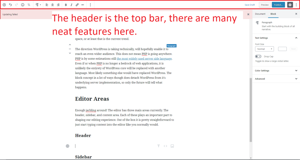
The editor header toolbar is featured at the top of the screen.
The header is the area at the top of the editor.

The editor in the picture above is set into the Top Toolbar mode, meaning that we see the block controls in the top toolbar as opposed to hovering over each block, in a more Google Docs, Microsoft Word fashion. Remember Word in many ways was the killer app of computers for many decades.

Left side of header

The first tool we see in the header is the block inserter. The block inserter is very important, as that is the main way we add new blocks. There are keyboard shortcuts available, but if you are a more visual, the plus button will be your most widely used button.

Next to that we have redo and undo controls. The undo and redo feature keyboard shortcuts as well, but they can be visually accessed here in the header. From my experience, the undo and redo functionality is pretty darn good in Gutenberg. This is partially due to the tech choices made for the project, as well as the great team behind it.

The next two parts of the header are really interesting.

Content Structure

One of the coolest features is the content structure menu, where we get a quick overview of our document.

Content structure menu provides a quick overview of the current document.
This current document at time of inserting this image.

I love this feature. I can see how many words I have typed, headings used, paragraphs used and how many blocks. We also get a nifty document outline. Remember we now have a data model of our content, things like this are more at hand and easy to implement. I see very quickly that there is an error in my heading structure, which I have just now fixed. Would I have noticed that in the classic editor? I highly doubt I would have. It’s all about the blocks.

Next on the list is the block navigation.

Block Navigation

When we open the block navigation we get a pretty neat menu of all of the current blocks. We can see our currently selected block, and select the focus for another block in the menu, or just get an overview of the blocks.

block navigation menu is accessed via the header.
Block navigation can also feature child blocks.

We get child block views available as well scoped to this particular block.

On first glance the menu seems very humble, straightforward, and helpful. The reality is that as the future of WordPress evolves, this block navigation will most likely evolve into a central way of interacting within WordPress.

There is an entire scheduled post on this.

That wraps up the left part of the header. The left part of the header is more content focused. The section to the right is more control and document focused.

Right side of Header

We won’t dive into this too much now, but you can save your post, preview it or save a draft from this area. You can close the sidebar as well by clicking on the gear icon. The sidebar is referred to in this case as Settings. Next to that is another hidden gem the “Show more tools & options menu”. We will look in more depth on this in a follow up post.

The right side of the header toolbar focuses on settings.
This area focuses around publishing and settings.

Sidebar

The sidebar, or Settings area of the editor is another cool part. At the top of the sidebar we have tabs: Document and Block. This allows us to separate different controls into different areas within the sidebar. The document controls, are mainly the features we have grown accustomed to in WordPress like: Visibility, Permalink, Categories, Tags, Taxonomies, Featured Image, and excerpt.

The sidebar document tab houses familiar controls.

Some of the areas that were meta boxes below the post content are now present in this document tab. If you don’t see something you are used to seeing, it has most likely been snuck into the document tab.

As we saw in earlier posts, depending on what block is selected, we will also get contextual controls for each block presented in the sidebar. This is one of the primary areas ripe for exploring extensibility of the editor interface.

Content area

The content area is maybe the most important part, but honestly all three parts synergize together. One is not as complete without the others. We will not be talking about the content area for now. This is mainly to outline it is one of the three key parts to the new editor interface.

Wrapping Up

This should give you a more clear picture of Gutenberg, and outline some of the more hidden gems of the experience. The editor will evolve, but I have a sense that the general UI will be the foundation for years to come. As always, stay tuned for the next post and drop any comments in the comment box.

Advent of Gutenberg – 4

So far we have looked at some of the fundamental content types, text and media. In this post we are going to do a very quick overview of all of the blocks available by default in WordPress. We can see all of the blocks available via the block inserter. By default you can access this via the plus icon in the top left of the screen.

Gutenberg block inserter

Now for every block!

Heading Block!

Above is the heading block, this is a paragraph block.

List Block

  • The list block by default is a unordered list.
  • It supports sub items
    • Like this
    • And this
  • We can also use a list block to do ordered lists.
  1. Within the lists we still have our rich text controls
  2. So we can do bold text
  3. As well as italic and links!

Image Block

image of a pier with birds flying
This is an image block with a caption.

Code Block

/**
 * Sometimes, when dealing with the web, you might want to share a code 
 * snippet. Luckily we have a code block!
 */

function gutenbergIsGreat( opinion ) {
  return opinion;
}

share( gutenbergIsGreat( true ) );

The code block is not much different than the preformatted text block.

Preformatted Block

With preformatted text,
We can do Poetry or other artsy versions of text.
Text that depends on custom whitespace is a great fit for a

Preformatted text block.

Next up is our friendly twitter embed!

Verse Block

Verse block
Is pretty much the same as preformatted text.
It happens to use the main font family instead of a monospace font.

Embed Block

Choyce Design; check it out!

Quote Block

Check out the great post above. This is a quote block. Next is a gallery

-Edwin Cromley

Gallery Block

Cover Block

Cover image block here

Audio Block

File Block

Video Block

My Daughter’s first music video! Please subscribe she needs to get to 100 subscribers!

Pullquote Block

Pull quotes are extra special fancy!

-Anonymous 2018

Table Block

Number of Gutenberg Blocks Used so far35
Number of Gutenberg Advent posts written so far4

There is some really cool stuff I have in store for tables! Stay tuned for future posts!

HTML Block

Even though we see a form on the front end, when creating this block we simply add in HTML. Oila!

Button Block

Columns Block

We can get two columns as well. Columns allow us to nest blocks within other blocks. Pretty neat!

Content, layout is going to be a future focus for the Gutenberg editor, and columns block will most likely play an integral role in that.

Media & Content Block

flowers and a dock

Flowers

Separator Block


Spacer Block

On a project recently, whitespace was critical to the marketing team for whatever reason. Down the exact pixel. There was no real way to accommodate the client, with Gutenberg however, they could have added a spacer block and set the height. I am not excited about this, but it is still very cool to have, and illustrates the creativity that Gutenberg enables.

Above is a 60px spacer block.

Archives Block

Categories Block

Comments Block

Posts Block

Shortcode Block

Embed Blocks

There is an insane amount of embeds out of the box available to WordPress, and these all use the Embed Block as their base. This was already possible in the classic WordPress editor, but now it is just clear that we can post content from:

  • Youtube
  • Twitter
  • Instagram
  • Flickr
  • Soundcloud
  • Spotify
  • Flickr
  • Animoto
  • Funny Or Die
  • Hulu
  • TED
  • PollDaddy
  • Many more…
  • And most importantly WordPress

Phew! That’s a lot of blocks. It will be very important in the coming future to figure out how to create more baseline blocks, and compose new blocks out of existing blocks. We do not want to create some ridiculous proliferation of blocks overwhelming us with options. The embed block is maybe my favorite block so far. One block that allows us to embed any content from the web directly into our posts. Great stuff.

Wrapping up

Now that we see the various content that Gutenberg makes readily available out of the box, next up we will do a more thorough overview of the editor interface, from both a technology perspective and usability perspective. As always, stay tuned! Drop a comment to share your thoughts on Gutenberg so far.

Advent of Gutenberg – 3

Gutenberg logo

Text is a primary content type, but more and more the interactions taking place are going beyond text. Images, audio, video, and visualizations are all becoming more prevalent. Text is a great medium. In most cases, it is more accessible, and easy to produce. Text does have some barriers, like video, you have to actively engage it by observing it, where audio allows you to passively consume the content, while working on something else. Video in some ways can also be a much quicker way of learning how to do something and is a great instructional medium, as it combines both the audio and visual aspects together. WordPress already has great support for different web media types, and Gutenberg will help make these easier to access and interact with.

Media in WordPress

WordPress in its current form has a media library allowing you to manage the media on your site. We’ll come back to this. One of the best parts of WordPress is that it plays nice with other content platforms, allowing us to share information more easily.

Embedding content

The current editor also allows for embedding content from other sites. For example you might add a video to your page by pasting a YouTube link into your content, and clicking enter. This process is one step easier in Gutenberg as you just paste the link, and the editor understands you are trying to embed a video, and creates a new block for you.

The current way of adding a YouTube video.

WordPress was ahead of the game as far as embedding other content, but now it is even further ahead. It is just so easy to add embeds. You can also add embed blocks. They look something like this:

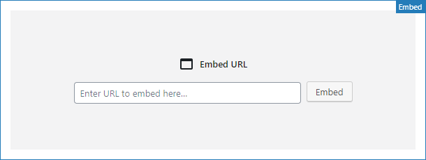
Image of embed block, features a URL input field, and submit button.
Embed block

We simply just enter the link, and if the link is embeddable, we magically get our embedded content. Super cool. So far in this series I have been embedding twitter links. Twitter can be crazy, but there is a lot of great stuff on it. Instead of expanding on tweets in the limited character set, where lots of bickering can happen, we can add commentary via a more thorough blog post. This was possible before in the classic editor, but something about this process is just so nice in Gutenberg.

Link to the gutenstats.blog site, outlining how widespread the usage of Gutenberg is.

Try out adding a tweet to one of your posts:

  1. Go to twitter
  2. Find the tweet you want to embed.
  3. In the top right you will see a downward arrow. Click there to expand the menu and “Copy link to Tweet”.
  4. In the editor on a new block line, paste the link. It will automatically start embedding the tweet. You can get to a new block line by hitting Enter, or the down arrow at the end of the current block you are typing in. ( More on this in the future. )
  5. See the tweet immediately appear in a stylish format.

Not much of a difference between the classic editor, but it is still a great experience. So far we have looked at embedding media and content from outside sources. Let’s look at a staple in WordPress; images.

Image handling in Gutenberg

Image block, featuring an upload button, media library button, or the option to insert via URL.
Image block in Gutenberg.

The above shows the default view of an image block, before we have selected an image. This view is known as a placeholder. Placeholders are great for a number of reasons. One of the most important is content layout. If we wanted to layout our content ahead of time, we could set a bunch of image blocks in various places, with the placeholders ready to go. We could then hand that off to our coworker in charge of selecting what media gets used. This is typically done in the current editor by using placeholder images, but with blocks, it will become more straightforward. It’s all about the blocks.

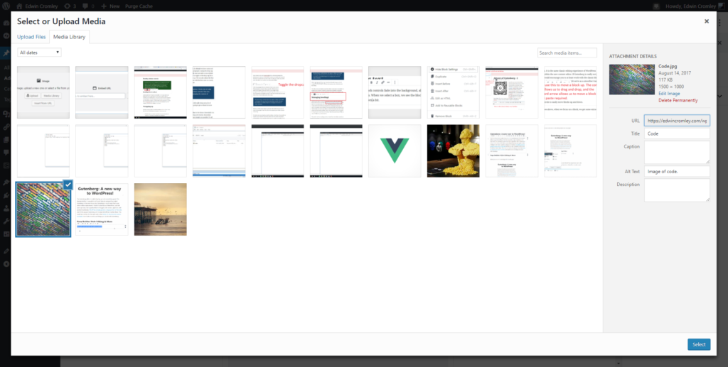
We have three options for adding an image: upload, media library, and “insert from URL”. Upload allows us to directly upload an image. I personally have had mixed results with this, and do not use it ever. Media Library will open up our media library and let us select the image to use.

The WordPress media library.

I have basically opened two tabs, one with my editor open, and one with the media library open. I simply just upload new images to the library, then switch to Gutenberg and pull in the new image. It’s all JavaScript powered, so no page refresh is necessary. It is actually a very quick workflow. Insert from URL seems to work well too, enjoy wapuu:

Wapuu

You can also drag and drop images into the editor. Currently, like the upload, my own experience has not been the best. Images start to upload but fail. The functionality has been tested rigorously, but for whatever reason my setup makes that extra hard. Don’t let little things like this take away from the Gutenberg experience. This is just the beginning. WordPress has a track record of fixing and accommodating all sorts of issues. WordPress has a strong people-centric focus.

All of the above is currently available in the classic editor. Gutenberg adds some new cool image features.

What’s new about images?

The cover image block!

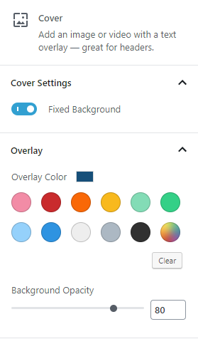
cover image controls including color overlay settings

One of the coolest blocks is the cover image block, shown above. We get some text over a full cover image background. We can even set a fixed background effect for a nice visual touch. Like any block a lot of the extra options are found in the sidebar, when that block is selected. Always check out the sidebar to see what is available!

Right off the bat we see the fixed background control set to on. We also see the overlay controls. In the post we see a nice dark blue overlay, by default it is a black overlay. You can also just set the opacity to 100%, and get a full screen background with text.

Remember that each of these sidebar areas are available for developers to extend the functionality of each block type. Who knows what people will come up with.

Working with images in the new editor.

Let’s look a bit more in depth at what options there are to work with in Gutenberg. We will start with the block toolbar.

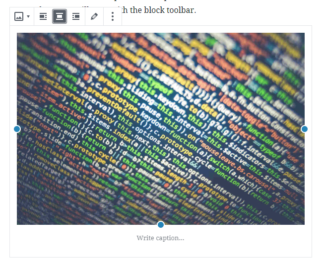
image block toolbar

Here you can see an image block selected with the toolbar above it. We currently have the center alignment set. You can left or right align an image which will float the content to the left or right, allowing the text to wrap around the image. The left and right alignment experience could use some tweaking, but it does work. We can quickly also change the image by accessing the Edit button, represented by a pencil. We also get sidebar controls.

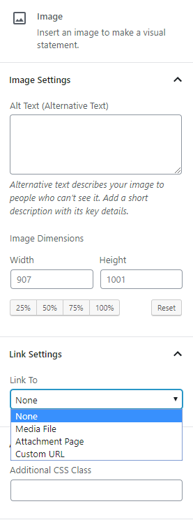
Image block sidebar controls contain alt text attributes, image dimensions, link settings, and additional css.

We can edit the alt text, image dimensions, link setting, and additional CSS class from the sidebar by default. If you can imagine a setting that is missing from this menu, plugins will become available to fill these gaps, or you can make your own!

Remember this is the foundation. Unlike the classic editor, room for extending the functionality is possible, and available.

With the new block model, galleries become much more engaging. We will look at galleries more in the future.

What lies ahead for images?

There is a lot of future room for improvement around images. With the block concept available to us, we will potentially be able to make different crops for different screen sizes or have an image set that serves a different image to different audience segments. This area is a big struggle for web content in general, and I feel that Gutenberg puts WordPress in a unique position to solve this problem.

Responsive images will become easier to manage, currently it is very challenging. This will greatly improve the mobile experience, a major win for the web.

I can also see new image editing tools being built into WordPress. You could upload a raw image, do a custom crop, maybe apply some filters, do some various light editing. The possibilities are very open, and I think we will see a lot of these new experiences being provided via plugins. Maybe the best will get rolled into core itself. Google docs has great image editing tools for this purpose. With the foundation presented by Gutenberg, this might allow WordPress to even surpass that experience.

Wrapping up

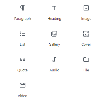
The media library plays a critical role in the new editing experience, allowing us to quickly add in content. Below we see a list of some of the common media blocks available:

List of common content blocks.

Image, galleries, cover image, audio, file, and video are all media blocks ready to go out of the box. These were all possible previously in the classic editor, but now everything is a bit more discoverable. In the past I might have to go to an external source and read about WordPress to understand how to use it. This problem is not fully solved, or ever will be, but the new editor interface is more inviting to explore, and you can figure things quickly by just poking around.

Leave any comments or feedback on what you would like to hear about next in the series!

Advent of Gutenberg – 2

Gutenberg logo

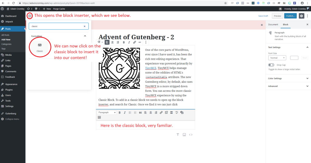
One of the core parts of WordPress, ever since I have used it, has been the rich text editing experience. That experience is powered primarily by TinyMCE. TinyMCE helps manage some of the oddities of HTML’s contenteditable interface. The new Gutenberg editor, by default, also uses TinyMCE in a more stripped down form. You can access the classic editor experience from within Gutenberg, by using the classic block. To add in a classic block, we need to open up the block inserter, and search for Classic. Once we find it we can just click to insert it into our content.

The block inserter is used to insert new blocks into the content.

I am now typing in the classic block. It won’t be distinguishable when you are reading this post, but it is nonetheless a classic block. We can do most of the things we are accustomed to in WordPress’s content area.

  • Here is a bulleted list
  • With items
    • Sub items!
  • Woo!
  1. An ordered list.
  2. Very similar experience to content editing.

Strikethrough text

Different color text.

Insert media.

It is the same classic editing experience of WordPress embedded within the new content editor. If Gutenberg is really not jiving with you, I would encourage you to at least work with the classic block, and then start exploring new blocks. This might serve as a smoother transition.

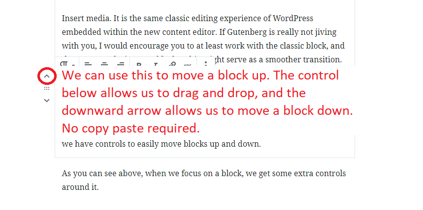
We are now exiting the classic experience. The downside of the classic experience is that we do not have blocks. It is just one big block of rich text. We lose control over the individual units. Remember, it’s all about the blocks. If I want to move anything, I have to use cut and paste. In Gutenberg we have controls to easily move blocks up and down.

When a block is selected, positional controls become available.

As you can see above, when we focus on a block, we get some extra controls around it. Cut and paste in particular, has been something that I see people struggle with. It is definitely a wide spread convention that any computer user is familiar with, but in my town, maybe shocking to some, computer usage is probably not something that everyone is totally familiar with. Copy and paste are an assumption we rely upon. I have seen people delete entire paragraphs to re order their content. Mastering copy paste can be much trickier than simply using the up and down buttons to shift around content; a small win.

When we are working with blocks, we get many additional controls. Let’s look at some of the new and familiar aspects of text in Gutenberg.

Managing text

As we type, the block controls fade into the background, allowing us to fully focus on our words. When we select a block, we see the block toolbar popup, let’s break that down a bit.

Block toolbar

Blocks now feature a block toolbar when the block is selected.

Above, we see the block toolbar hovering on top of the text. The first control is the block type switcher, allowing us to convert the block to another type. We aren’t going to worry about that right now. Next to the switcher we see the text alignment controls. We can left align, center, and right align our text on a paragraph by paragraph basis very easily.

Right aligned.

Center aligned

Left aligned.

Next up after that are our classic text formatters. We have bold, italic, link and strikethrough. Very neat, and readily available to use, as they appear right above the block we are working on. After the formatters is the more options control, represented by three vertical dots.

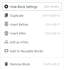
The more options menu enables quick access to generic block funcionality.

More options will feature generic options for the block, like duplicating, deleting etc. It will also show the quick keys for any actions that have a quick key. Each block toolbar as a whole, will have its own unique controls that are specific to it.

Each toolbar is also very customizable from a developer perspective; allowing new controls, or user specific controls to be added and removed. The block controls don’t stop there either. We also get another area of the editor that allows us to interact with blocks, the sidebar.

Sidebar controls

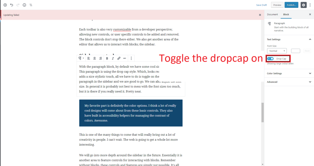
With the paragraph block, by default we have some cool sidebar controls. This paragraph is using the drop cap style. Which, looks really neat and adds a nice stylistic touch, all we have to do is toggle on the drop cap for a paragraph in the sidebar and we are good to go. We can also adjust the font size. In general it is probably not best to mess with the font sizes too much, but it is there if you really need it. Pretty neat.

Drop caps for paragraphs can be toggled form the sidebar

The sidebar controls are really going to be an amazing area to explore what can be done with content. This is an area where plugins can really do a lot of incredible things. I can also see some plugins going completely overboard and ruining the experience. Let’s try to not go overboard.

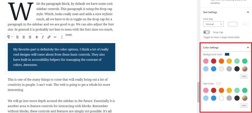
My favorite part is definitely the color options. I think a lot of really cool designs will come about from these basic controls. They also have built in accessibility helpers for managing the contrast of colors. Awesome.

Color settings for paragraphs are located in the sidebar.
Color options for paragraph blocks.

This is one of the many things to come that will really bring out a lot of creativity in people. I can’t wait. The web is going to get a whole lot more interesting.

We will go into more depth around the sidebar in the future. Essentially it is another area to feature controls for interacting with blocks. Remember without blocks, these controls and features are simply not possible. It’s all about the blocks.

Managing headings

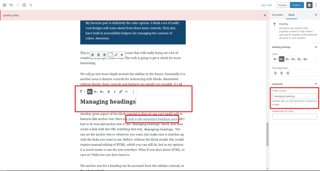
Another great aspect of the block concept is that we can very easily add in features like anchor text. Here is a link to the managing headings area. All I had to do was add anchor text to the “Managing headings” block, and then create a link with the URL matching that text, #managing-headings. You can set the anchor text to whatever you want, just make sure it matches up with the links you want to use. Before, without the block model, this would require manual editing of HTML, which you can still do, but in my opinion it is much easier to use the new interface. What if you don’t know HTML, or care to know? Well now you don’t have to.

Adding anchor text to headings can be accessed in the sidebar.

The anchor text for a heading can be accessed from the sidebar controls, in the advanced tab.

Headings serve as a way to structure our documents, in a semantic manner. Now that Gutenberg brings the block model to us, it is relatively simple to add a table of contents to our posts now, organized by heading structure. This could be done as a block, which we will see in the future.

Heading block toolbar

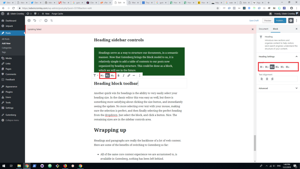
Another quick win for headings is the ability to easily select your heading size. In the classic editor this was more in line with Microsoft Word. There is something more satisfying about clicking the size button, and immediately seeing the update. No more selecting over text with your mouse, making sure the selection is perfect, and then finally selecting the perfect heading from the dropdown. Just select the block, and click a button. Nice. Additional sizes are in the sidebar controls area.

Headings can be quickly controlled in the block toolbar and sidebar areas.

Wrapping up

Headings and paragraphs are really the backbone of a lot of web content. Here are some of the benefits of switching to Gutenberg so far:

  • All of the same core content experience we are accustomed to, is available in Gutenberg, nothing has been left behind.
  • By having blocks, we now have more fine grained control over the structure of a document.
    • Text color, and background color.
    • Drop caps.
    • Font size.
  • We can do important tasks more easily that used to be a pain.
    • Heading anchor text.

It’s not as though these tasks were impossible in the classic editor, it is that they were not as at hand, ready for us to grab and use. I feel so much more creative when writing in the Gutenberg editor. It’s just fun.

Text is only one part of content experience. Next we will be looking at how Gutenberg handles media elements. I hope you are enjoying the series so far, and comeback tomorrow for the next post!

Advent of Gutenberg – 1

The WordPress space, and other open source communities are building anticipation around the new content editor, Gutenberg. The development of the editor and overall process, has been controversial, inspiring ClassicPress, a fork of WordPress. I think the controversy is definitely perceived at a higher level of severity, being amplified by the current cultural climate permeating many things. Controversy aside, new things are on the way and in this season of gift giving, I am very excited for the world to receive the gift of this new content editing foundation.

It’s all about the blocks

The new foundation of WordPress is not being built on the editor persee, instead it is being built upon the block concept. Gutenberg does feature a new UI that is different from the current editor. The current WordPress editor always felt boxed in, closed off, and subconsciously limiting to creativity. Your content was in a small box surrounded by all of these other distracting elements. The new user interface for WordPress will be more open; with a pure focus on content. I can focus so much more easily on the words as I type in Gutenberg. That’s just the new interface; great, but not groundbreaking. It’s all about the blocks.

What’s in a block?

The idea of a block is vague, and abstract. A block is essentially an individual unit or grouping of content. This post so far has been comprised of headings, and paragraphs. Each is its own block, and as a whole, the entire post becomes a block containing this content. So what’s the big deal?

Unlike the previous editor or really any content editor I know of, there is now a deeper fundamental connection between the visual layer and underlying data model. This connection is made possible by having a more accessible, programmable, data driven content layer. Sure, the posts end up being stored as HTML, or more specifically WP Post Grammar, but that isn’t necessarily the data model of blocks. WP Post Grammar is just the current storage format. So although we had content before, and now we can make the same content with the block editor, there is a very subtle and fundamental shift occurring.

To explore this shift further, let’s think about numbers. A number is this vague abstract concept, much like a block. Most of us have become accustomed to using a base ten numerical system using 0, 1, 2, 3, 4, 5, 6, 7, 8, 9. So much can be expressed with just different variations of these numerals. If we want to figure out what 9 x 9 is, with sufficient learning, we get an answer of 81, fairly easily. Let’s use another system to represent the same numbers; Roman Numerals. Now we have IX * IX which is equivalent to LXXXI. Math is usually not widely loved, but let’s be thankful for not having to learn it in Roman Numerals.

There was a time when many people who needed to figure something out had to use this terrible number system. The very syntax itself made certain thoughts unthinkable, certain ideas inexpressible. If I lived in that time, I would have never questioned it, I would have carried right along unaware of this other world that had not been discovered. The very foundations of arithmetic would not be as discoverable with a system like Roman Numerals. With the web, and the computational medium in general, we are in its infancy. I am excited to see what worlds we can open by having a new creative foundation. Gutenberg and the block concept, I think will play a part in opening up new creative outlets.

WordPress’ content as it is now

With Roman Numerals there are all of these rules around each character, and the placement of each character can effect its meaning and the meaning of other characters. It is really terrible. No one uses Roman Numerals anymore. Let’s look at them if you are not familiar, so you can see how confusing they are. “I” is 1, so “II” would be 2, “III” 3. You might think four would be “IIII”? Wrong; “IV” ( :facepalm: ). “IV”, what the hell is this? Let’s see. “V” means 5, and “X” means 10. Somehow putting “I” before “V” or “X”, means subtract 1 from the following value. So “IX” is 9, and “IV”, is four. But “VX” is just not a number, it doesn’t mean subtract 5 from 10. It only gets worse from here.

Roman Numerals just really do not make any sense at all, or there are too many different rules that govern them. You can’t keep track of it all in your head. I can’t help but feel this same problem plagues WordPress. I have seen many people struggle learning WordPress, including myself. Like Roman Numerals, once you learn them you can navigate your way around, but you do not realize what you are missing out on.

In WordPress we have widgets, nav menus, post types, meta boxes, shortcodes, links (not used anymore), media, post formats, page templates, and whatever else is brought in by the plugin ecosystem. There are so many things you have to keep track of when building content with WordPress. We are just used to it. On top of that each of these content types can have many super confusing interactions, and special cased rules. The block concept unifies these content types. Blocks on their own will not solve the woes of WordPress, but they afford us the ability to start building a new future.

Future of blocks

Dennis Snell shared a really cool block on twitter:

Dennis Snell is a really nice person, and has been very active on the parser for WP Post Grammar.

So here I am, in the moment of thinking about this, grabbing Dennis’s tweet, and sharing it in my post as a tweet block. Super fast, super easy. I can see it right now as I type. Imagine how this will allow us to share ideas more quickly, more expressively, and with WordPress, unlike other platforms, I have sovereignty and authority over the content I interact with.

Dennis, in only 137 lines of code, created a drawing tool. Would you imagine drawing in the current state of WordPress? Would it only take 137 lines of code? When I complete my doodle, because it is now a block, maybe I can just send it to you, and you can add your own doodle on top and send it back?

It goes further. It is maybe an insensitive or uninformed opinion, but I believe Gutenberg will be even better for things like accessibility. Why? Since Gutenberg is now connecting us with the underlying content in a new way, we will have new ways to represent content, and represent how to interact with content. Although the design stance has centered around making a uniform experience, I can see plugins providing alternate editing experiences accommodating everyone’s needs to a further level. This doesn’t mean that the core should not be accessible, but I think perhaps even our current ideas around what web accessibility means could change.

Reality of today

Gutenberg is not without its faults. There have been communication failures in the process. There are bugs. There are outstanding issues. As I write, on my host, I see warnings of updates failing. This could be very scary to a non technical user, as they will believe their work is not saving. Even though I see these warnings, my content is saving. I have never lost content using Gutenberg. I lost power a couple weeks back, right in the middle of writing a post. When I checked back, not a single letter was missing. That is the level of care put into this editor. I am sure there will be Gutenberg horror stories, but in the WordPress community one thing that I have seen and can guarantee is that people care. They will work hard to try and help as many people as possible with an open ear and heart.

Even though Gutenberg could change a lot of things, maybe it won’t. Maybe it will be just a more pleasant writing experience, or not. Maybe it will be incredibly underwhelming. Maybe some of the technical decisions will sink WordPress into further technical debt. The reality is that nobody knows what is going to happen. As Gutenberg stands today, it is not a radical shift from how we currently use WordPress, but to me it symbolizes a new road ahead, that is open and awaiting new visions to guide the way. 

What’s next?

For this season of generosity, I will be making 25 posts in honor of advent, to show the gifts that I think Gutenberg will bring to WordPress and the web. Each day we will learn something new about Gutenberg, what it can do, and where it could go. I leave the rest up to you!

Rethinking Meta Boxes with the new WordPress block editor: Part 1

The post has been updated to reflect some code improvements pointed out by Daniel Bachhuber.

I have spoken to a number of agencies, and WordPress developers, and I have come to one conclusion; ACF and Meta Boxes are critical for their deliveries. ACF, particularly the pro version, seems to be used quite a bit. Most of the work I do does not use ACF, but I certainly have used meta boxes a fair bit. We have probably done all sorts of crazy stuff with meta boxes and they have served us well. The new block editor can be somewhat scary as it appears to be replacing meta boxes. In fact, one of the goals of blocks is to replace things like meta boxes. Metadata management is definitely a crucial selling point for WordPress to online businesses. There seems to be the thought that the new block editor will ruin WordPress as a CMS because we are no longer dealing with structured data. I don't think this is the case at all, blocks will bring even more structure than currently exists, hopefully after reading this you will be excited to make the leap to Gutenberg. The tricky part is going to be the transition.

Making the leap to Gutenberg

The new block editor brings a couple major changes to the world of WordPress development. The block API that powers it, seeks to consolidate many elements of WordPress. The editor portion, is a relatively large React/Redux application powered by JavaScript. WordPress development has largely been fragmented across many APIs and I think the new block API, once it is fully fleshed out, will help bring about a better set of standards, and allow developers to create more engaging experiences in less time. You can already ship fast with WordPress, but once the new block editor is running in full gear, I feel it will greatly accelerate the rate at which people create things with WordPress.

The leap will hopefully not have to be painful thanks to the work being done by the Gutenberg team. Part of the goal is to make sure the transition is as smooth as possible. Support for meta boxes, shortcodes, and other features are already included. The meta box support is also continually being improved upon. It is important to not just force every developer to rewrite all of the work they have done in JavaScript. Instead there will be an indefinite period where the block editor will have near complete backwards compatibility, which is really a tremendous feat that should be praised. So big shout out to Riad Benguella and Andrew Duthie who have really been hauling ass on this project! Give them some love. Speaking of Riad, I highly recommend checking out his post about Gutenberg and meta boxes.

If there is backwards compatibility in place though, what is the big deal with blocks and the block editor, why should I rewrite things as a block? Well, it is honestly not fully apparent why blocks matter. Let's quickly compare the two and hopefully I can pique your interest.

A basic meta box implemented in the classic WordPress way

plugin.php

<?php
/*
 * Plugin Name: A classic meta block.
 * Version: 0.1.0
 * Author: Edwin Cromley
 * Author URI: https://edwincromley.com
 * License: GPL3+
 *
 * Description: Random meta box.
 */


add_action( 'add_meta_boxes', 'sample_add_metabox' );
add_action( 'save_post', 'sample_save_metabox', 10, 2 );

/**
 * Adds the meta box.
 */
function sample_add_metabox() {
	add_meta_box(
		'post-notes',
		__( 'Post Notes', 'textdomain' ),
		'sample_render_metabox',
		'post',
		'normal',
		'default'
	);
}

/**
 * Renders the meta box.
 */
function sample_render_metabox( $post ) {
	// Add nonce for security and authentication.
	wp_nonce_field( 'custom_nonce_action', 'custom_nonce' );

	$notes = get_post_meta( $post->ID, 'notes', true );

	?>
	<textarea style="width: 100%; height: 200px;" name="notes">
		<?php echo esc_html( $notes ); ?>
	</textarea>
	<?php
}

/**
 * The code below will not run because my host blocks writing
 * super globals in anyways shape or form. So pretend $POST is
 * the actual superglobal.
 */

/**
 * Handles saving the meta box.
 *
 * @param int     $post_id Post ID.
 * @param WP_Post $post    Post object.
 * @return null
 */
function sample_save_metabox( $post_id, $post ) {
	// Add nonce for security and authentication.
	$nonce_name   = isset( $POST['custom_nonce'] ) ? $POST['custom_nonce'] : '';
	$nonce_action = 'custom_nonce_action';

	// Check if nonce is set.
	if ( ! isset( $nonce_name ) ) {
		return;
	}

	// Check if nonce is valid.
	if ( ! wp_verify_nonce( $nonce_name, $nonce_action ) ) {
		return;
	}

	// Check if user has permissions to save data.
	if ( ! current_user_can( 'edit_post', $post_id ) ) {
		return;
	}

	// Check if not an autosave.
	if ( wp_is_post_autosave( $post_id ) ) {
		return;
	}

	// Check if not a revision.
	if ( wp_is_post_revision( $post_id ) ) {
		return;
	}

	if ( ! isset( $POST['notes'] ) ) {
		return;
	}

	update_post_meta( $post_id, 'notes', wp_unslash( sanitize_text_field( $POST['notes'] ) ) );
}

To see the actual code that runs checkout this repo. Pretty straight forward classic WordPress meta box registration. Everything is PHP, we create the view in our render function and when the post is saved we do some validation and update the meta value. This meta box will work just fine inside of the Gutenberg editor as well. Let's look at how we could recreate a meta box as a block in Gutenberg.

Meta block:

plugin.php

<?php
/*
 * Plugin Name: Sample Meta Block!
 * Version: 0.2.0
 * Author: Edwin Cromley
 * Author URI: https://edwincromley.com
 * License: GPL3+
 *
 * Description: A sample meta block to illustrate how easy using Gutenberg is.
 */

/**
 * Enqueue block assets.
 */
function meta_block_enqueue_block_editor_assets() {
    // Enqueue JS that registers a block.
    wp_enqueue_script(
        'meta-block',
        plugins_url( 'meta-block.js', __FILE__ ),
        // Here we declare our dependencies for creating the block.
        array( 'wp-blocks', 'wp-element', 'wp-components' )
    );
}

add_action( 'enqueue_block_editor_assets', 'meta_block_enqueue_block_editor_assets' );

/**
 * The authentication callback for our secrent notes meta key.
 *
 * @param boolean $allowed Whether the user can add the post meta. Default false.
 * @param string $meta_key The meta key.
 * @param int $post_id Post ID.
 * @param int $user_id User ID.
 * @param string $cap Capability name.
 * @param array $caps User capabilities.
 * @return boolean Whether the user has permission or not to
 */
function meta_block_secret_notes_auth_callback( $allowed, $meta_key, $post_id, $user_id, $cap, $caps ) {
    if ( current_user_can( 'edit_post', $post_id ) ) {
        return true;
    }

    return false;
}

/**
 * Register meta field for the rest API.
 */
function meta_block_init() {
    // Register a post meta
    register_meta( 'post', 'notes', array(
        'show_in_rest'  => true,
        'single'        => true,
        'auth_callback' => 'meta_block_secret_notes_auth_callback',
    ) );
}

add_action( 'init', 'meta_block_init' );

/**
 * Filters out the notes meta field from rest response for unauthenticated users.
 *
 * @param WP_REST_Response $response The response object.
 * @param WP_Post          $post     Post object.
 * @param WP_REST_Request  $request  Request object.
 * @return WP_REST_Response The modified rest response.
 */
function meta_block_make_secret_notes_secret( $response, $post, $request ) {
    $data = $response->get_data();

    if ( isset( $data['meta']['notes'] ) && ! current_user_can( 'edit_post', $post->ID ) ) {
        unset( $data['meta']['notes'] );
        $response->set_data( $data );
    }

    return $response;
}

add_filter( 'rest_prepare_post', 'meta_block_make_secret_notes_secret', 10, 3 );

/**
 * Register the block template for the post post type.
 *
 * @param array  $args      Associative array of data used during registration.
 * @param string $post_type The current post type being registered.
 * @return array Associative array of data used during registration.
 */
function meta_block_change_post_block_template( $args, $post_type ) {
    if ( $post_type === 'post' ) {
        // Create a template of our is great block.
        $secret_notes_block = array(
            'sample/secret-notes',
            array(
                'template_lock' => 'all',
            ),
        );

        // Check if template exists and if not add template.
        if ( ! isset( $args['template'] ) || ! is_array( $args['template'] ) ) {
            $args['template'] = array();
        }

        array_unshift( $args['template'], $secret_notes_block );
    }

    return $args;
}

add_filter( 'register_post_type_args', 'meta_block_change_post_block_template', 10, 2 );

meta-block.js

( function( blocks, element, components ) {
    var el       = element.createElement,
        Editable = blocks.Editable;

    blocks.registerBlockType( 'sample/secret-notes', {
        title: 'Secret Notes',
        category: 'common',
        isPrivate: true,

        /**
         * Declare the attributes involved.
         *
         * We declare the notes attribute and one of its properties is a
         * meta key, which will be the corresponding meta key we save on the
         * post meta db.
         */
        attributes: {
            notes: {
                type: 'string',
                source: 'meta',
                meta: 'notes'
            }
        },

        edit: function( props ) {
            var notes = props.attributes.notes;

            function setSecretNotes( notes ) {
                console.log( notes[0] );
                /**
                 * This is a tad bit hacky as the value passed in by the
                 * Editable component will be an array of values. In this case,
                 * it will always be an array of one string, which is the value
                 * we want.
                 */
                props.setAttributes( { notes: notes[0] } );
                event.preventDefault();
            }

            return el(
                'div',
                {
                    key: 'secret-notes',
                },
                [
                    el( 'h3', {}, 'Secret Notes:' ),
                    /**
                     * Set the value to the current value being auto loaded in.
                     * Set the onChange handler to set our new attributes, this
                     * will auto save our meta values.
                     */
                    el( Editable, { onChange: setSecretNotes, value: notes } )
                ]
            );
        },

        save: function() {
            /**
             * The save function will represent what is saved into the post's
             * post content, since we are not adding anything to the post
             * content
             */
            return null;
        }
    } );
} )(
    window.wp.blocks,
    window.wp.element,
    window.wp.components,
);

If you want to check out the code go to this repository. These are about the same lines of code, and they honestly are not much different. We define how the data should be saved and how it should be rendered in both cases. Different API, same result. So why go through all of the trouble to reimagine meta boxes as blocks?

Benefits of blocks replacing meta boxes

There are a number of benefits of blocks over anything else, however templating, uniformity, and composability are the main benefits.

Templates

If you noticed the block template being registered for the post type, this is one of the powers of using blocks instead of the classic method. You can position the meta boxes where they actually need to go. We can provide default values ahead of time as well. When you start to think about the implications for page building and themes it gets very interesting. Being able to structure your content however you want leads to much improved user experiences. The content itself can now be outlined ahead of time, which helps when many content authors are involved and need to adhere to some standard. The template system is not fully fleshed out yet, but when it is, it will be incredibly powerful. Meta boxes fall short in this aspect.

Uniformity

Sometimes meta boxes are not the correct tool for the job and we need to use another one of WordPress's APIs to get the things done. Sometimes the meta boxes I have created will power a shortcode, widget, or custom TinyMCE thing. It always gets awkward though because the experience is so disjointed.

For instance, I do a lot of eLearning projects and often a link to assignments, modules, or the current week's todo items need to be embedded in the content. These are being powered by data somewhere else often controlled by a meta box. I can't just hard code these pieces into the theme templates though, as the instructors want to have control over where these elements are placed. Meta boxes only get you part of the way to where you need to go. Then depending on the case, a TinyMCE button is created and there is a unfulfilling user experience getting this to work. If the author needs to update the list of todos, they need to find the meta box for it somewhere on another page. If they want to change the list of todos for that specific page, they most likely will need to create an entirely new list of todos. It gets tedious quickly.

Now that I am running these systems on Gutenberg, it is effortless for instructors to be onboarded and get up to speed. The block API brings us uniformity, which allows the meta box that is powering something to also be embeddable in the content, or not. It's up to us and there is incredibly flexibility. The uniformity of the experience also makes it easier for the people actually using the editor, because once they have learned how to insert, place, and update the block, they have learned it for everything else. There is no need to go to different pages, and do all sorts of weird workflows. Since blocks will unify meta boxes, content, custom TinyMCE, widgets, shortcodes, and whatever else into one thing, a new property will also arise; composability.

Composability

The new block editor does not quite fully deliver on composability yet, but it's getting there. Composability allows us to create something new out of other elements. A web page is basically a composition of various HTML tags. The HTML is parsed into DOM nodes and eventually renders onto our screen after a bunch of other stuff happens. We might create an employee profile by combining, a figure element, with an image element, a figcaption, and maybe some p elements for various information bits. If these pieces did not share a uniform interface, we could not create the employee profile in HTML, we would have to do something else. HTML would not be very useful.

WordPress's current content system for better or worse is a fragmented mess. It kind of makes sense, but as a new comer myself, it was weird learning a lot of the concepts and the WordPress way, as it seemed different for almost every piece. Widgets needed to be created one way, and could only be easily embedded in certain places, which needed to be registered beforehand, unless you wanted to hard code the widget somewhere. Confusing.

If I spent all of my effort creating a widget, well I was out of luck when I wanted to put it inside my content. Instead, I needed to then create a shortcode. If I wanted to do the same exact thing, but slightly different, I would need a new shortcode. I also wanted a widget that did the new thing as well, so I had to create another widget. If I wanted to use the new widget functionality inside the old shortcode it leads to a gigantic mess. The level of reusability is limited, and as a developer we really only have an illusion of reusability when working in WordPress.

Imagine if every time you wrote HTML, you had to keep each element as its own. For instance:

<p>Here is some HTML. Now I </p><a href="awesome.com">have a link</a><p>inside of the same text.</p>

No tag could ever be a part of another. div and its many incarnations would be unusable. We would be limited to linear ordering of basic elements, slabbing one piece after the other. If we wanted to do something complex, it would need to meticulously be strung together. Nothing could ever be grouped together or composed in a natural way. If we wanted to move a piece we would have to move everything with it. We don't work this way with HTML, so why do we accept it for how we work in WordPress. Again, imagine never using div or even conceiving what div is, that is the world we are working in. Widgets can not be used with shortcodes, or TinyMCE, and vice versa, without a lot of extra work. It is hard to fully see how limited we are by WordPress, because it is great, but when all of the pieces of content can become more easily interchangeable with each other, we will see new experiences emerge.

With the concept of composability, an image slider could potentially also be used to create any kind of slider. It could even be fashioned into a PowerPoint of sorts. The text and images, would be their own unique piece, that fit inside of a slide, and each slide inside of the slide show. Each slide could be powered by a different set of data providing a unique experience for each person. The web browser is already a PowerPoint of sorts that we don't even take into account because the fluidity between each frame is abrupt and we don't fully even know how to even effectively use the medium of the web or computers yet, at least I don't.

The block editor will make WordPress an unparalleled CMS. This is just part one of reimagining meta boxes as blocks, and I hope to show you some of the cool things I have been working on, and get you excited about the future of WordPress! The upcoming articles will be more code oriented and go over how to actually think in blocks and how to actually write the JavaScript and PHP that powers them. If you are interested by the Gutenberg editor, make sure to try it out or check in on the GitHub repository.